Reading a recent article on Flavorwire on embarrassing book covers for classic literature, I noticed a bit of a recurring trend. Many classic books written by women/about women are repeatedly rebranded by publishers as 'chick lit' or plastered with mediocre model shots more suited to a trashy romance novel than a piece of high quality literary fiction.
I've selected a few of my favourites from the Flavorwire list (and one of my own finding I couldn't resist to include). Yes, they may make you cringe, but I think many show that many publishers take a design strategy that is both condescending towards the reader and distorting of the writers' original messages.

Firstly, there's the 50th Anniversary issue of Sylvia Plath's The Bell Jar which caused a considerable internet storm for it's apparent 'chick lit' cover. You could argue that the largely pink design including a woman applying make up is whistling to the wrong tune - said tune being a startling novel about a woman experiencing mental illness in the 1950s/60s. It is a haunting book - but the chick lit-y appearance of this issues sells it as something it is not. Some people have defended the image - surely this semi-autobiographical novel is a reflective piece on the author's own life events, and this notion of reflection is modeled? Kirsty Grocott argued the cover is a fitting choice and illustrates the predicament the protagonist faces.
Is it a case of condescending 'chick lit treatment' or a seemingly well-intentioned cover? I have yet to make up my mind.

Moving on swiftly - what about this cover of Wuthering Heights? Yep that's right - this is a Bronte novel and not an addition to the Twilight saga, though the design seriously echoes the series' characteristic artwork. The publisher even uses the vampiric 'Love Never Dies' motif seemingly to suck (pun intended) fans of Meyers' work into buying Wuthering Heights.
This rebranding of a classic novel downgrades it to the same level as the vampire series and even pragmatically shifts its genre - does the popular mind project an expectation of fantasy onto this title? Does it damage the author's reputation? It's definitely an attempt to market Wuthering Heights for a younger audience, and attracting younger markets toward Victorian literature can only be positive. But through this extremely conscious case of rebranding, is the publisher actually condescending the audience?

Without seeing the author's name on the following copy, you would be forgiven for thinking the following title belonged to a writer like Candace Bushnell (Sex and the City). But wait - this is actually a genuine cover of Night and Day by Virginia Woolf. Yes, Woolf, who published this novel in 1919 (are you, like me, doubting the existence of halter necks in 1919? Just saying).
Night and Day is concerned with the plight of women's suffrage - and I'm not sure if the model pictured suits this theme. Sure, green was one of the suffragette colours ... but maybe she could have a purple sash? I'm just making suggestions *innocent face*.
I don't know why this is supposed to attract readers to Woolf but it seems condescending to make classic literature look like a magazine for the purpose of marketing.
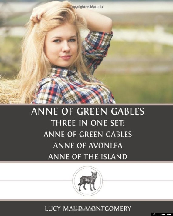
Finally, here's a copy of Anne of Green Gables with a sultry country-bumpkin blonde. I would have LOVED to have been in the design consultation meeting for this one - 'Look, we know that sex sells. Agreed? Ok, can sex sell a beloved children's book about a young orphan girl? Absolutely!'. Grrrr.
Also, let's not forget that Anne is GINGER - a fact which a simple google image search could tell anyone. I despair.